
Grands
From booking courts to building rivalries.
- Services Provided
- Strategy
- Visual Identity
- Client
- Grands
- Delivered
- Brand strategy
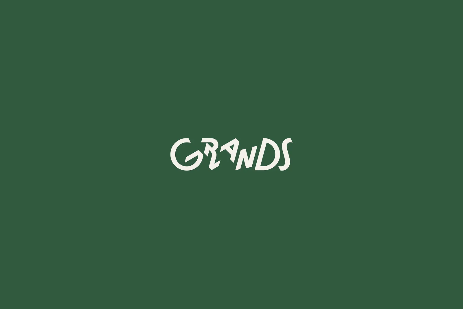
- Logotype built on movement
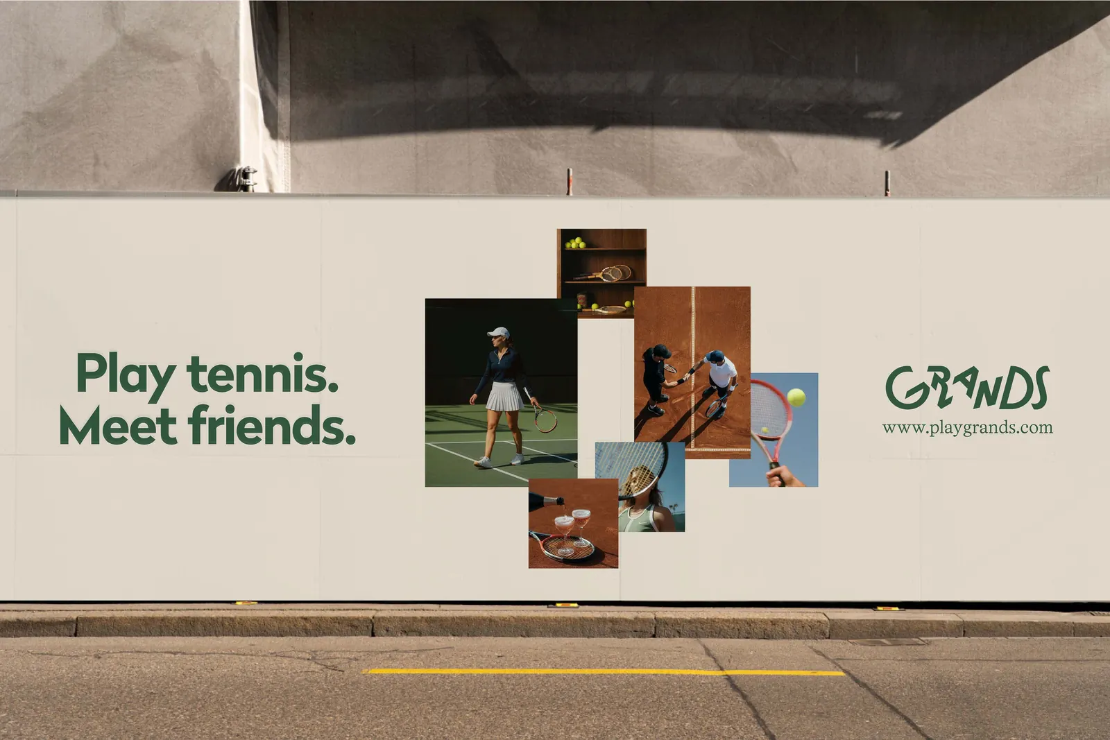
- Performance-driven visual language
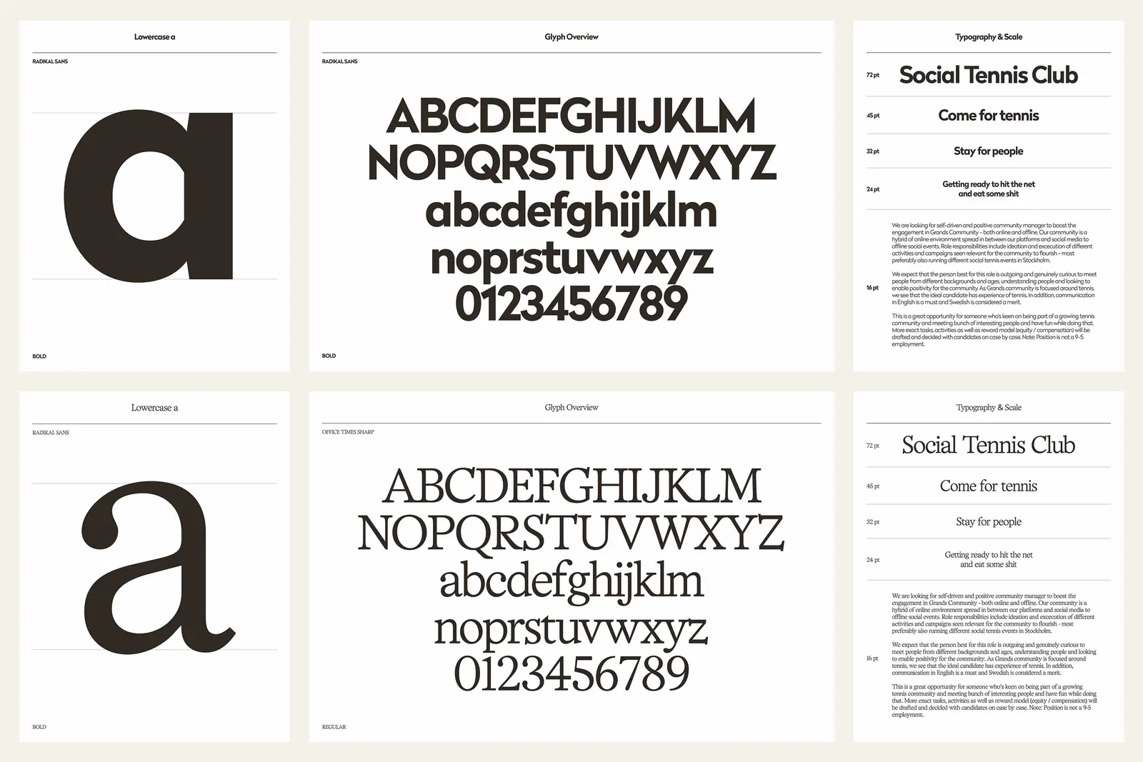
- Palette and typography for clarity on screen
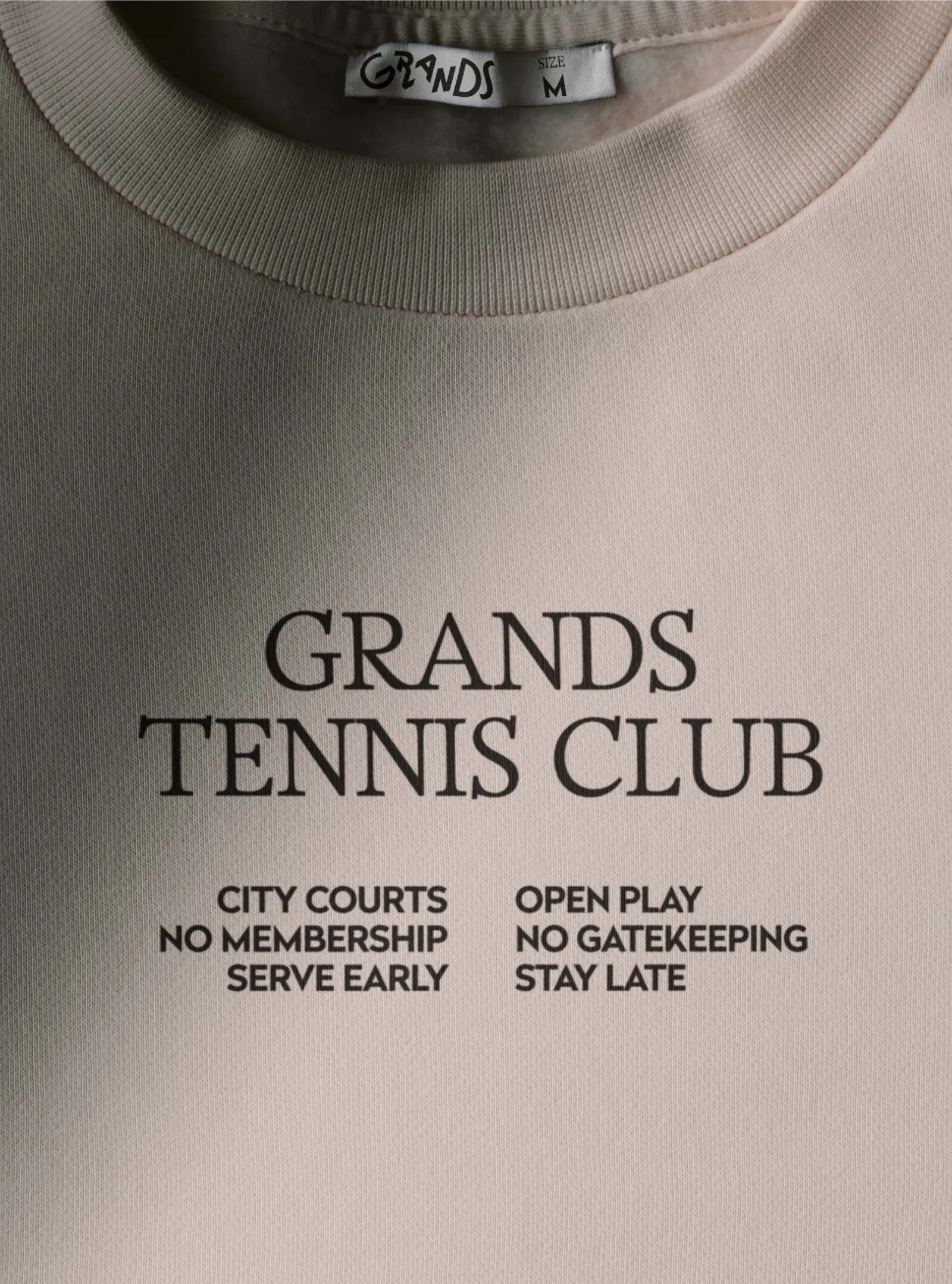
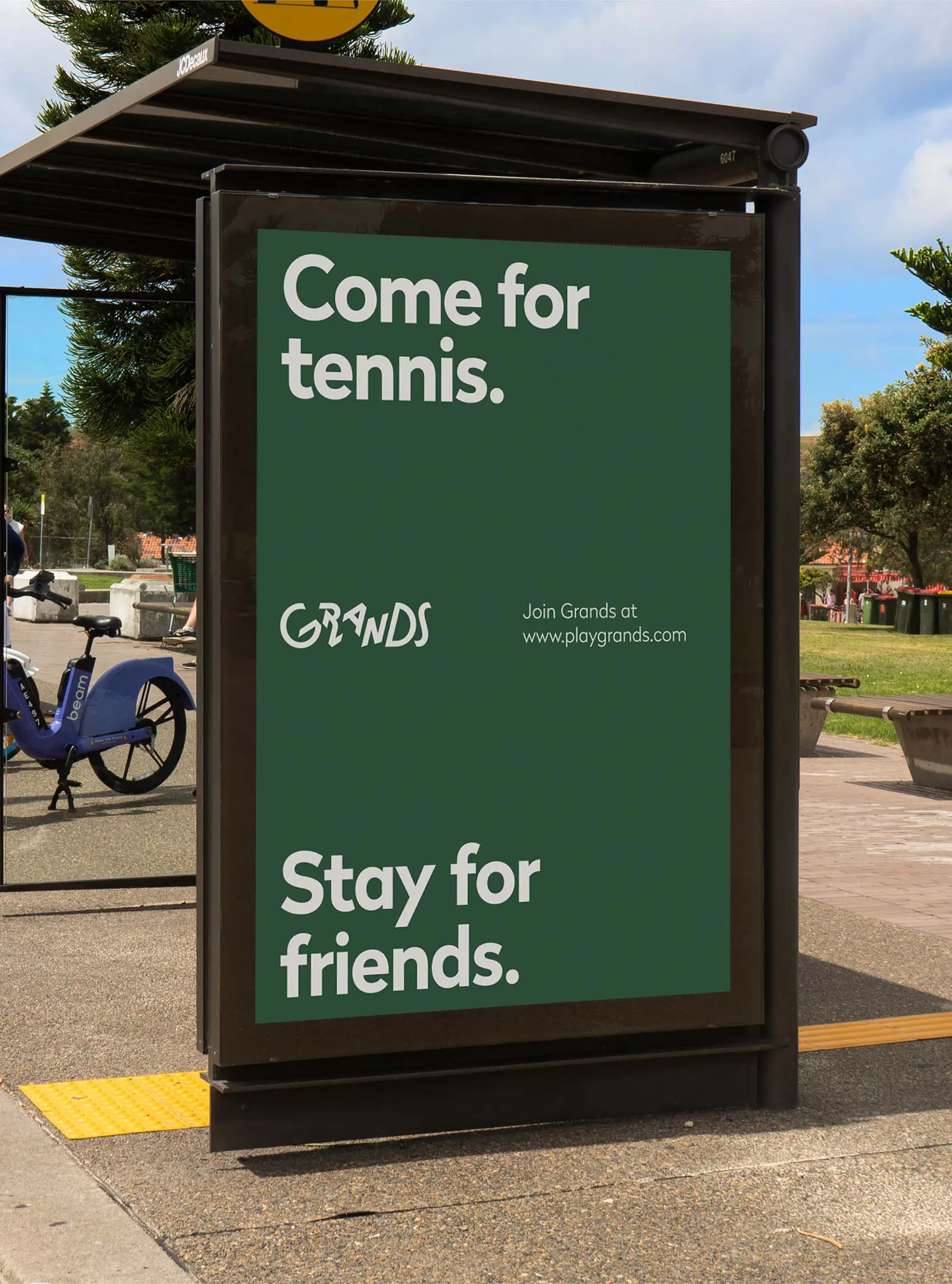
- Confident, direct tone of voice
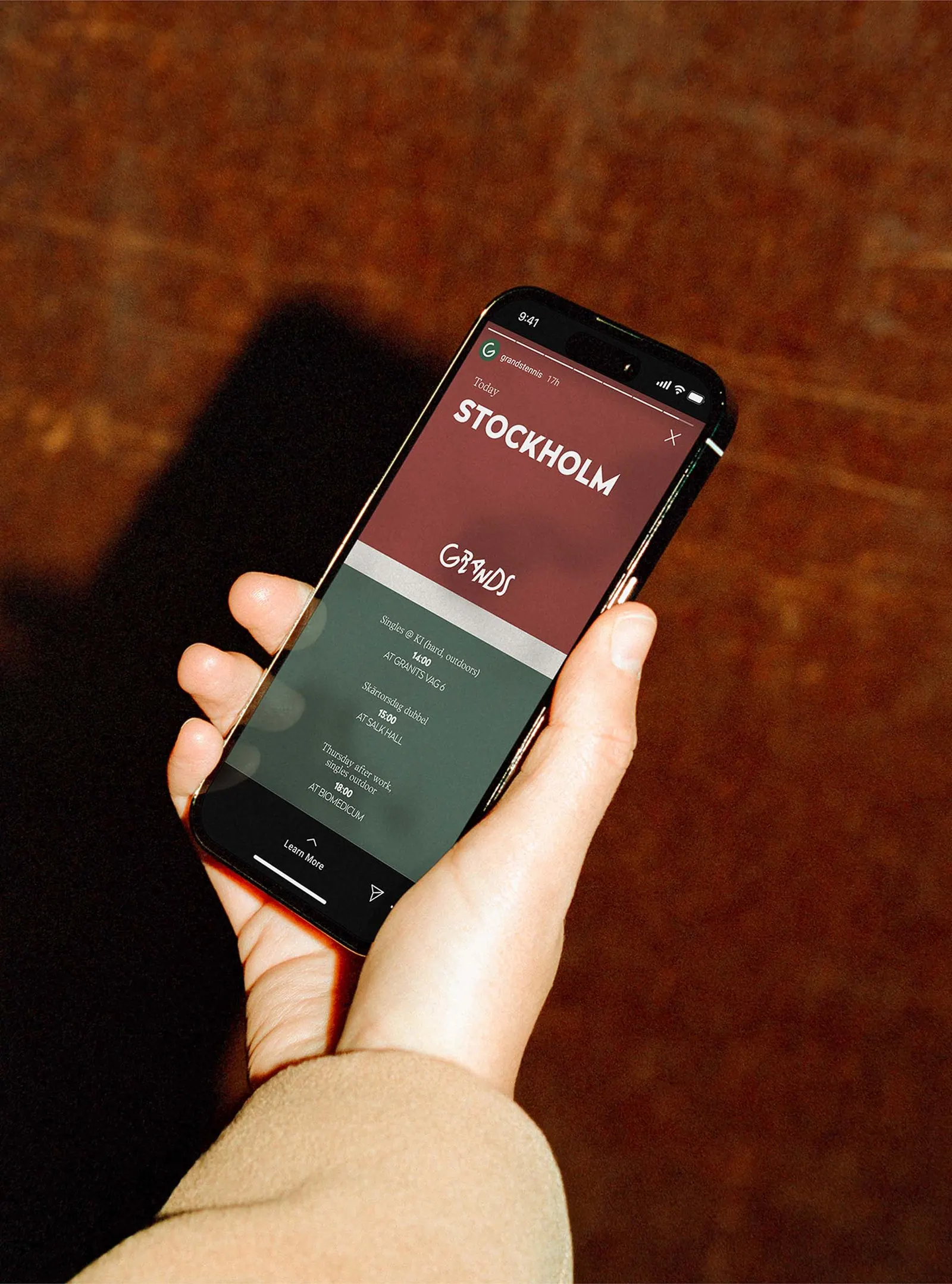
- The identity applied to the app screens
- Made at Cookin’ Goods with the studio team.
The brief
Grands is a tennis platform that matches players with the right opponents. Tennis players had to choose between expensive club memberships and public courts where nobody knew who would turn up. Grands set out to close that gap, and the brand had to make the match itself the reason to join.
The decision
We built the strategy on the principle that great matches happen when great players find each other, so the brand puts rivalries and progress ahead of booking courts. The tone is confident and direct, and the palette and typography balance intensity with clarity on screen.






Bahtana →