
Phreshly
Heritage as the advantage, not the decoration.
- Services Provided
- Strategy
- Visual Identity
- Packaging
- Website
- Client
- Phreshly
- Delivered
- Brand strategy
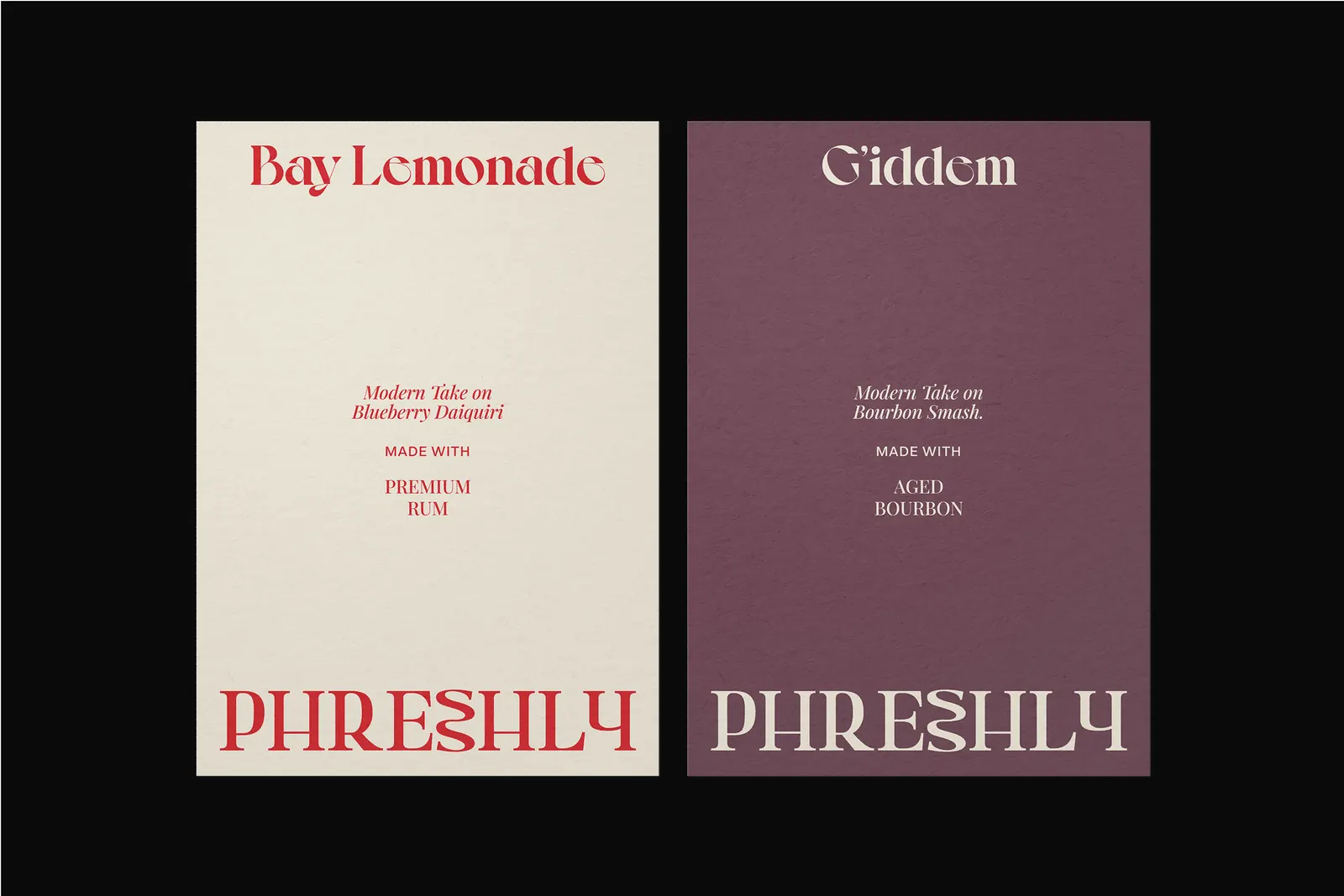
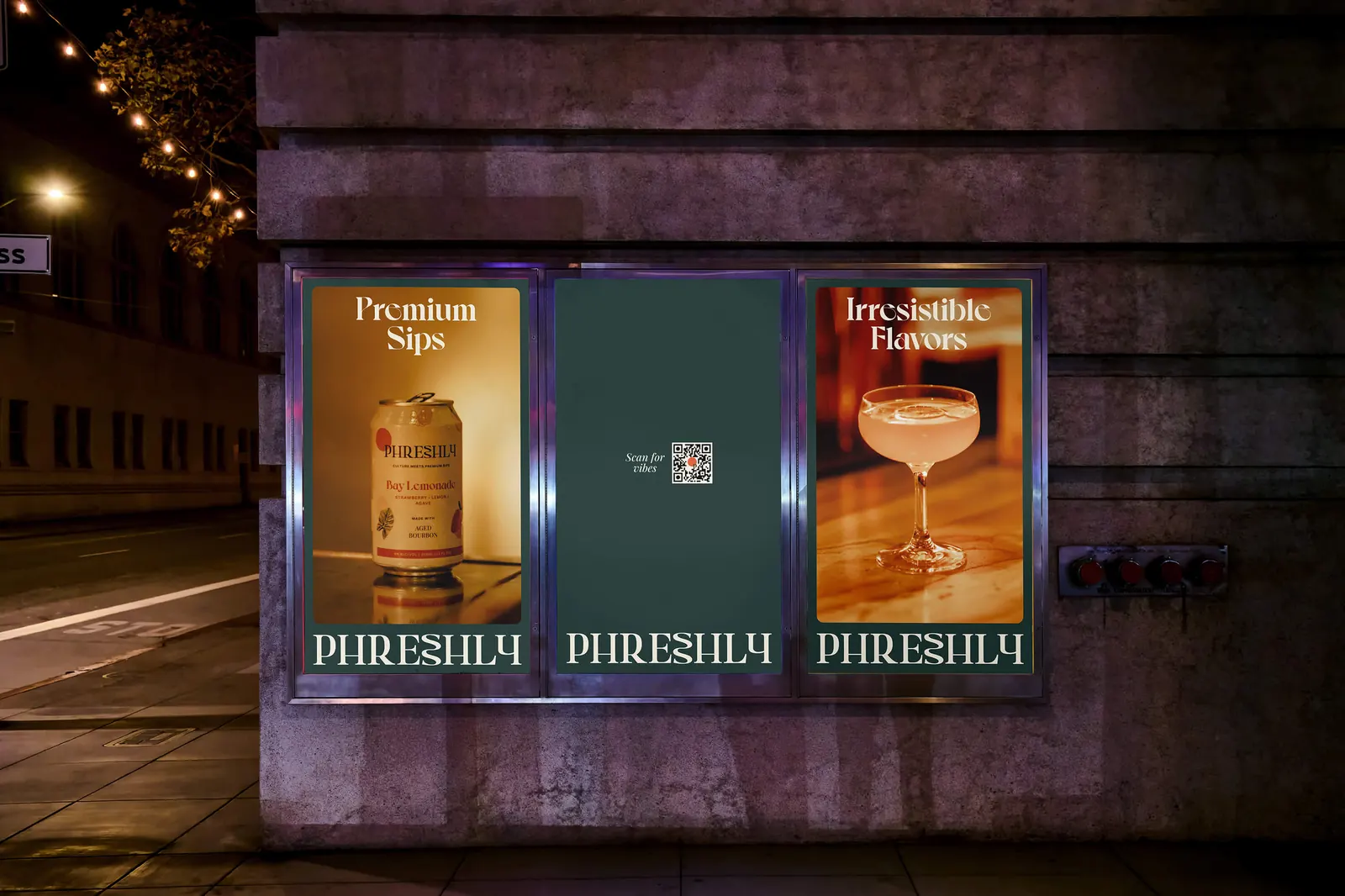
- Identity around a serif typeface and warm color
- Custom ingredient illustrations
- Warm earth tones and rich jewel colors
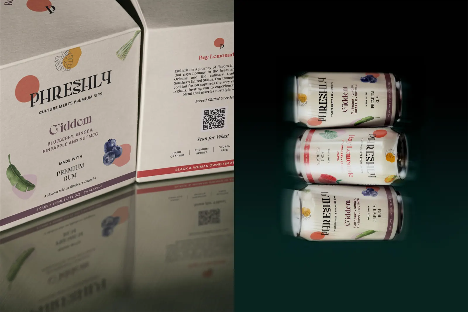
- Packaging redesign
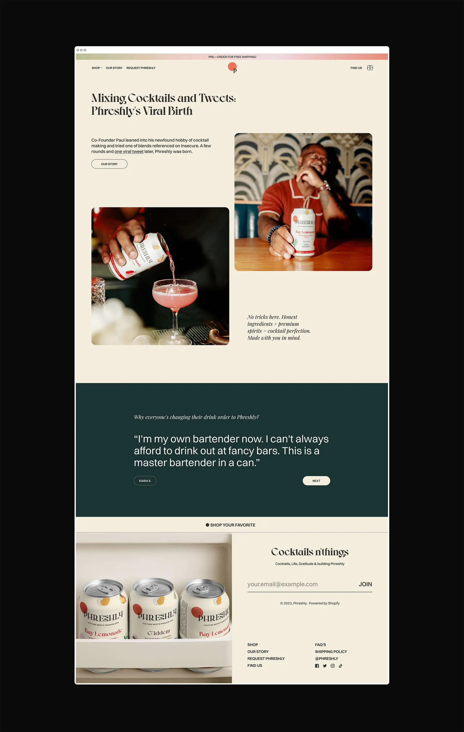
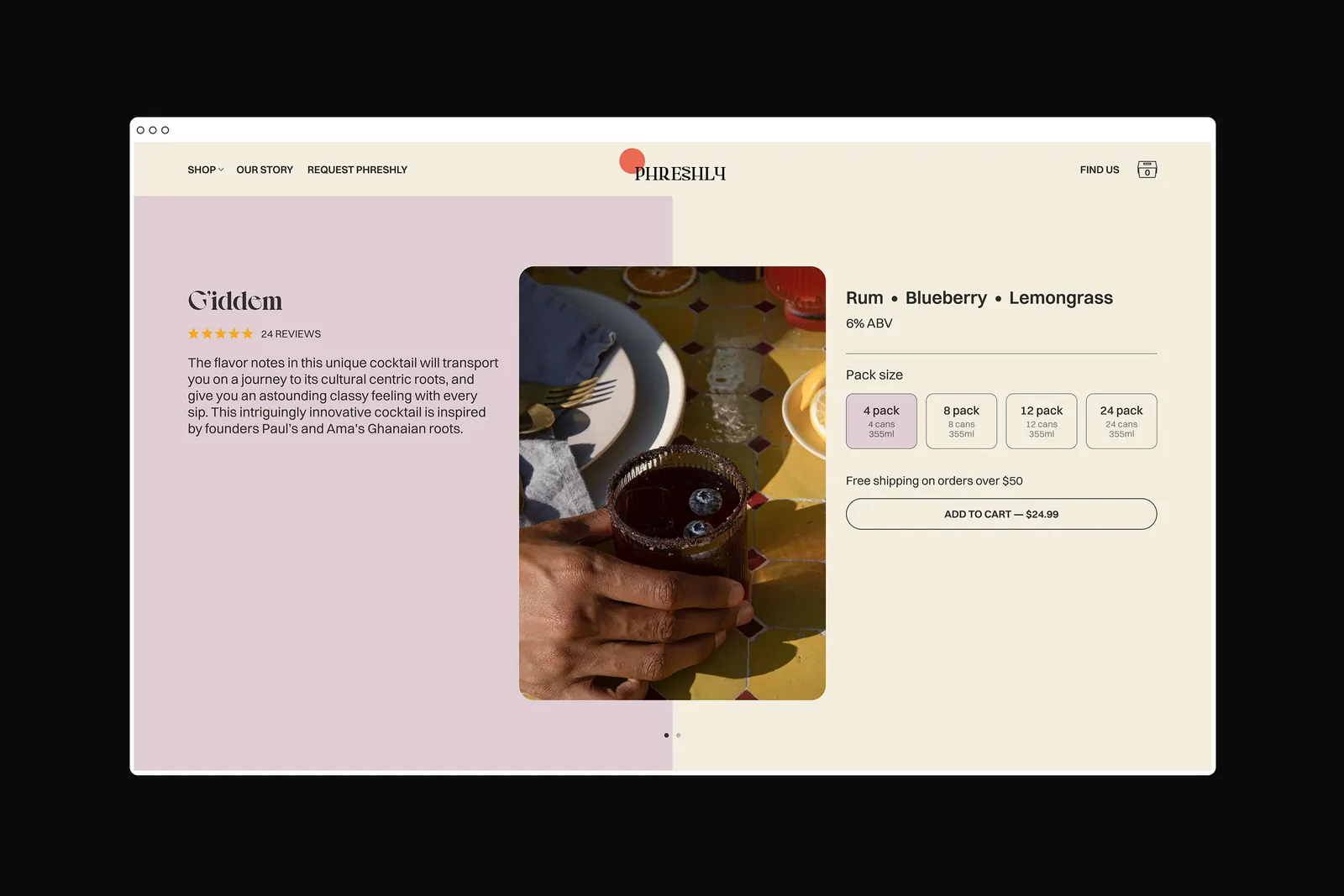
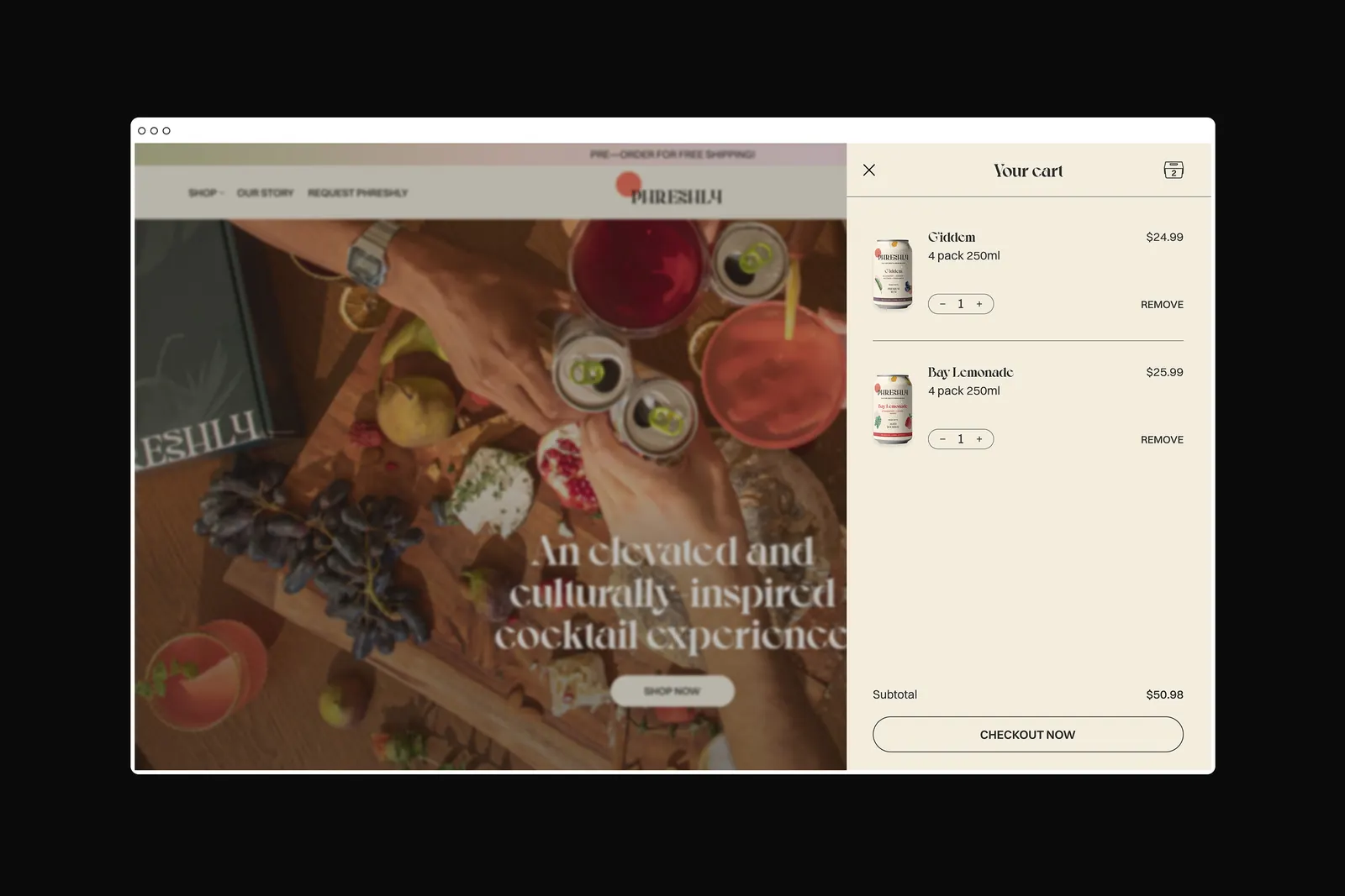
- Website redesign
- Made at Cookin’ Goods with the studio team.
The brief
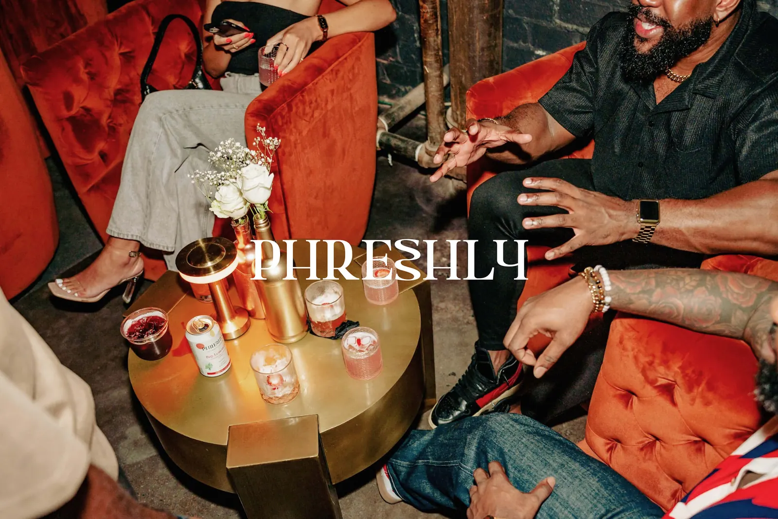
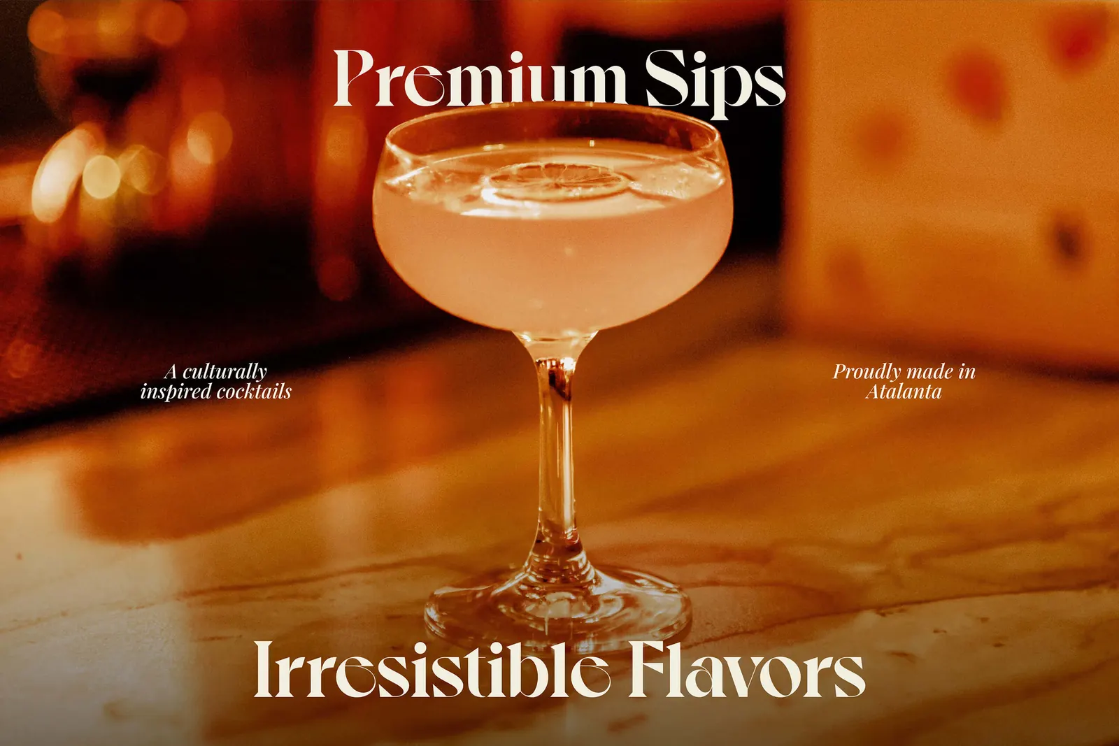
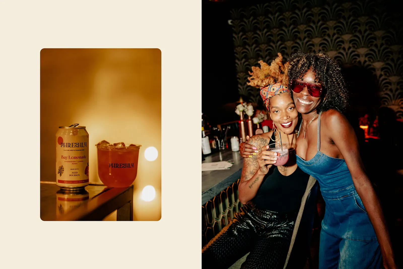
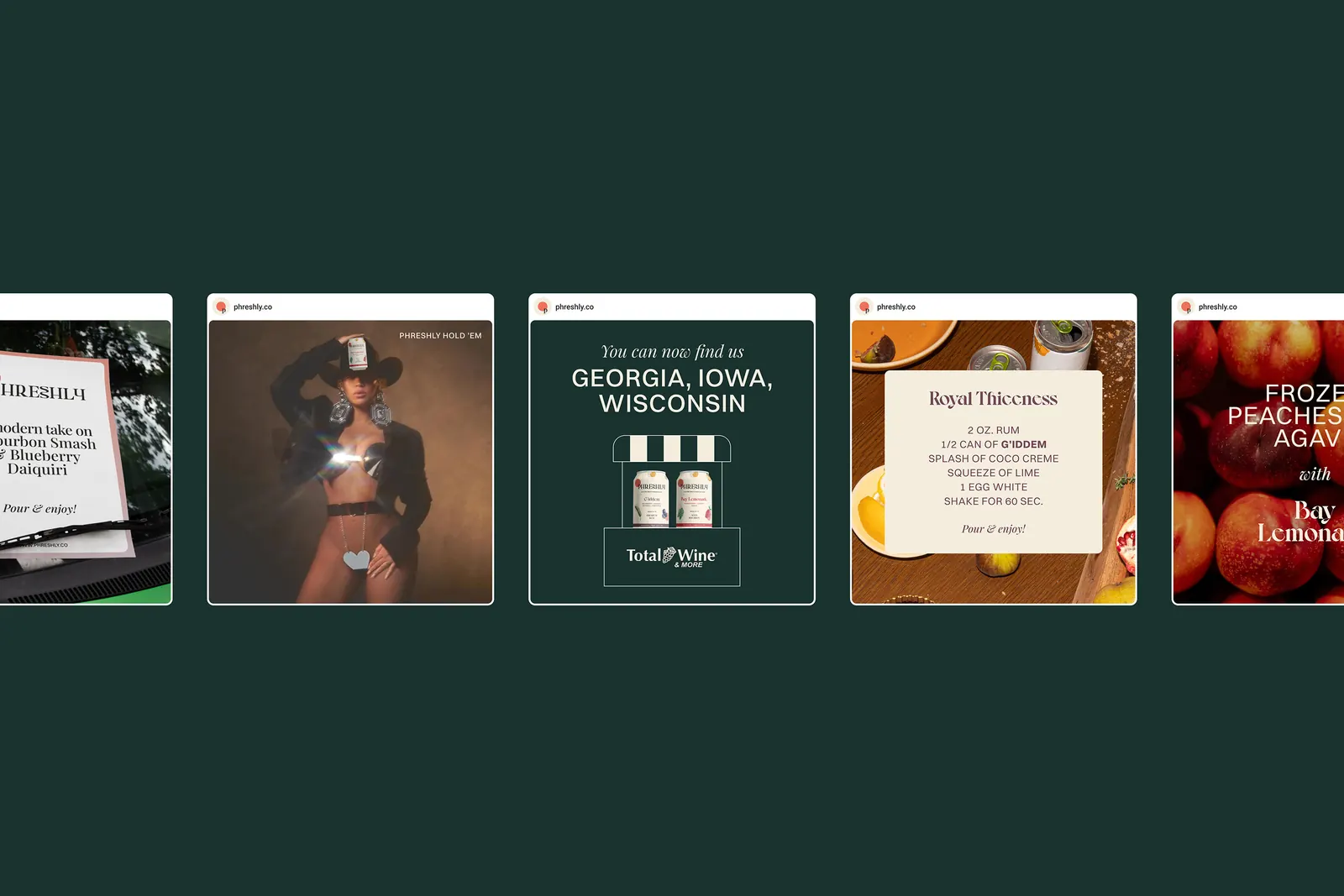
Phreshly is a premium cocktail brand rooted in Black culture. Premium cocktails often treat culture as decoration, and Phreshly saw it differently. It wanted an identity that keeps its culture at full strength, with the packaging and the website redesigned as one system.
The decision
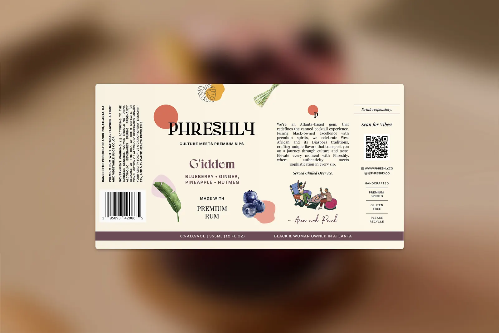
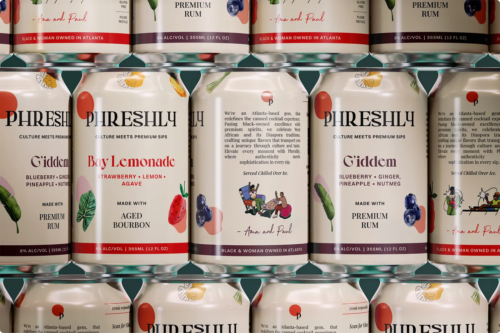
We made heritage the differentiator, so the culture behind Phreshly became its advantage in a category that tends to treat culture as a compromise. Custom ingredient illustrations make freshness visible and tactile, so the quality shows on the pack before anyone reads a claim.
SeventhWave →