
WeightQuest
Guided, not monitored.
- Services Provided
- Strategy
- Visual Identity
- Website
- Client
- WeightQuest
- Delivered
- Brand strategy and tone of voice
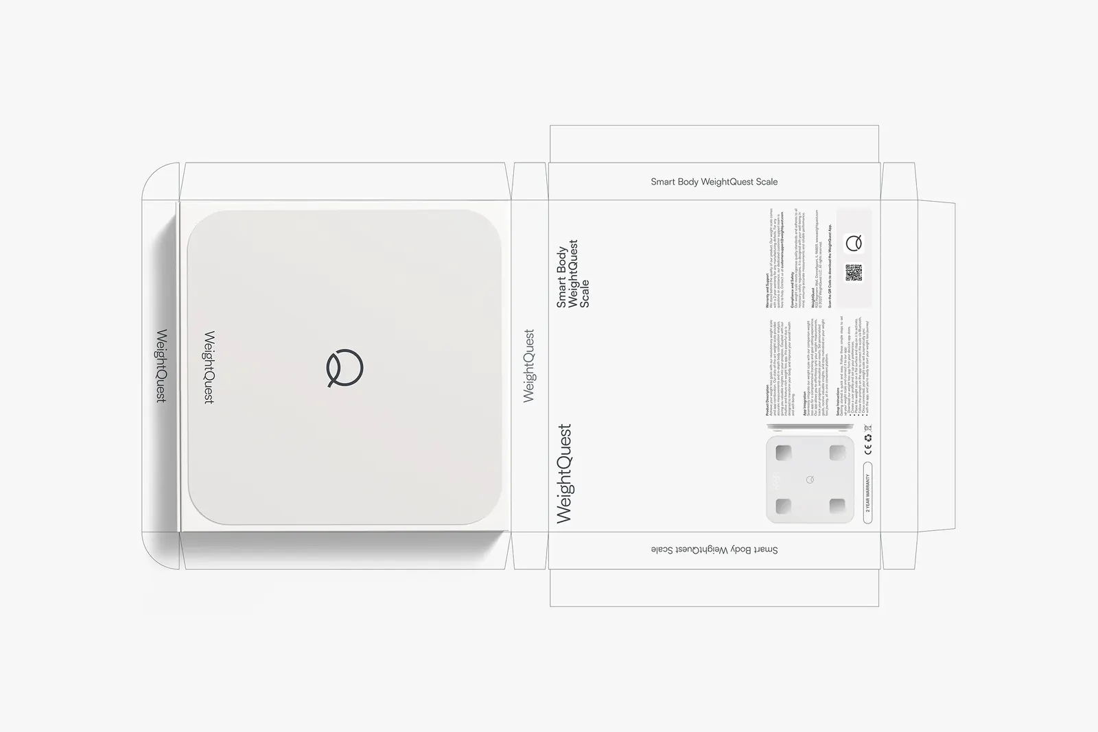
- Logo from smooth, rounded geometry
- Calming purple palette with neutral tones
- Modern typography
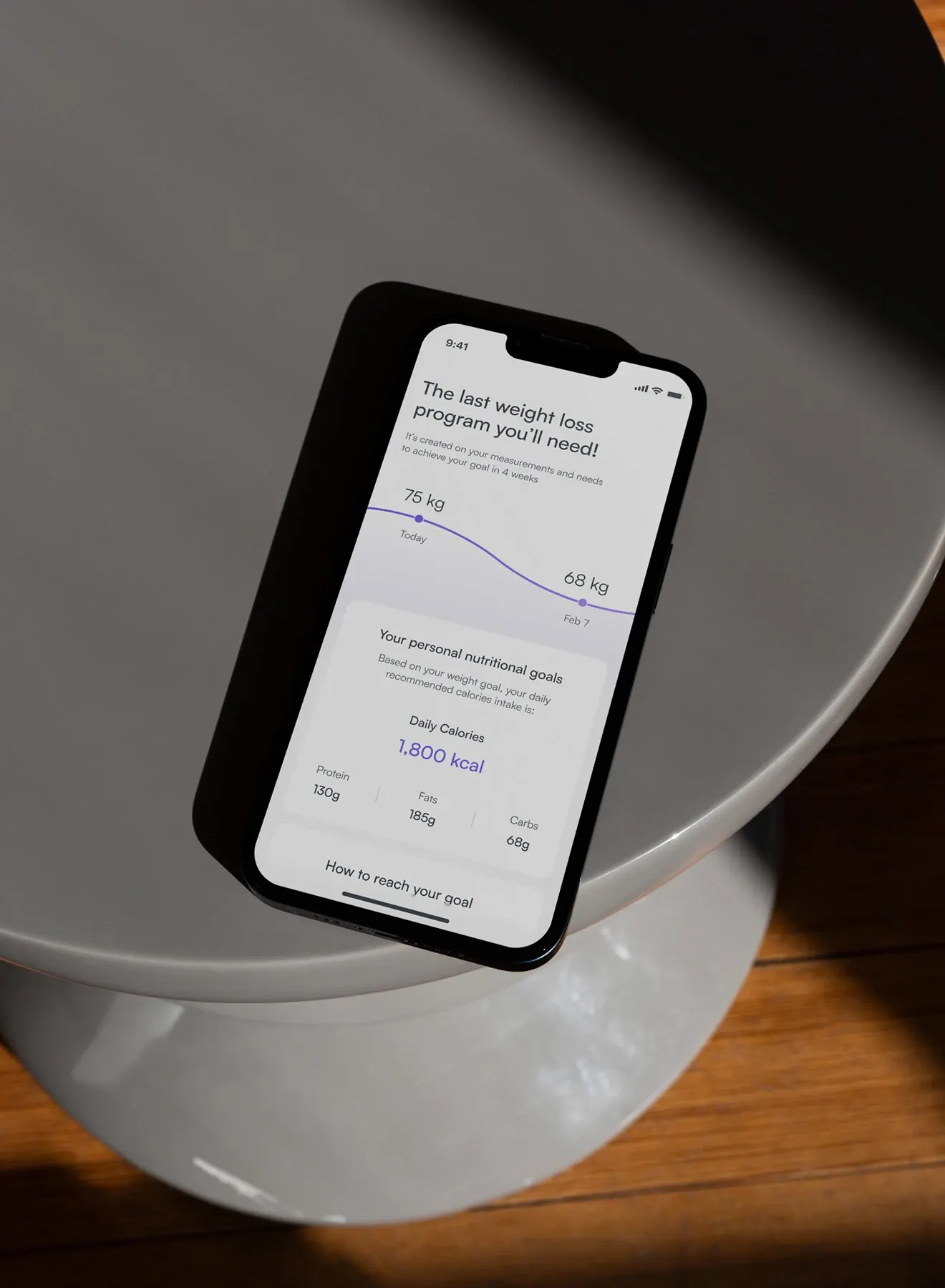
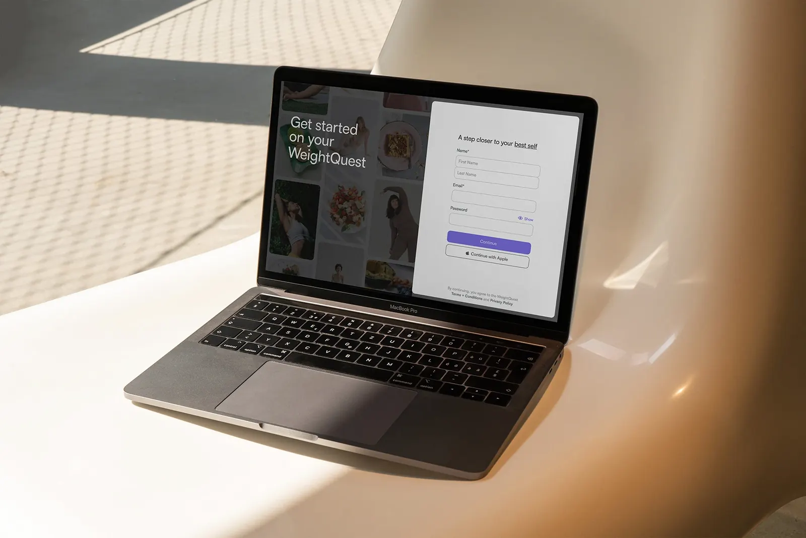
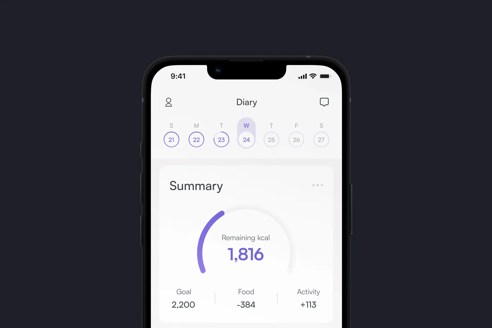
- The identity carried into the app and the website
- Made at Cookin’ Goods with the studio team.
The brief
WeightQuest combines a smart scale, a mobile app and personalized coaching in one system for women. Weight loss is often framed as discipline, and most apps feel clinical or overwhelming. WeightQuest wanted a brand for women that feels personal and encouraging, in a category that swings between hyper-medical and overly soft.
The decision
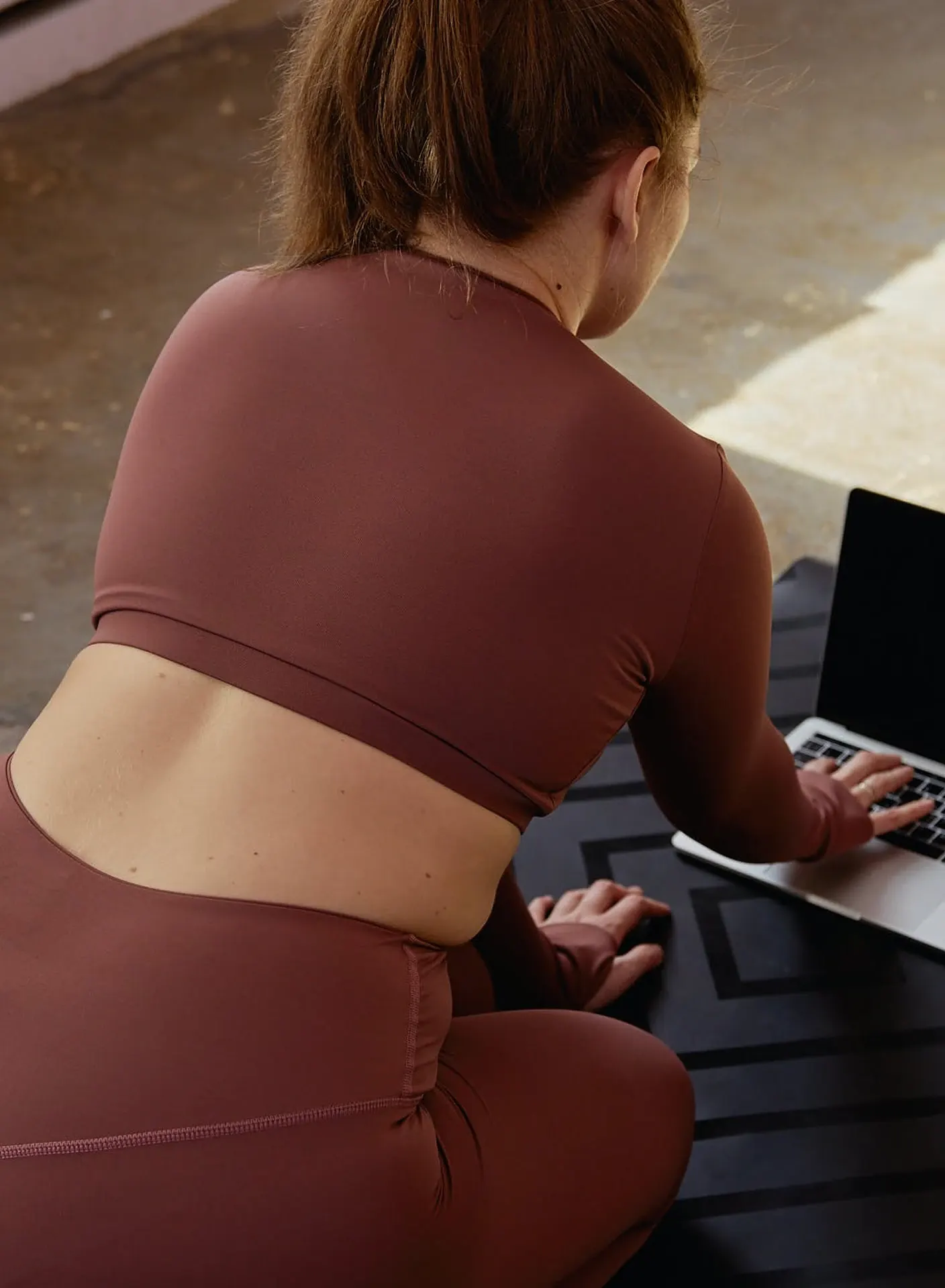
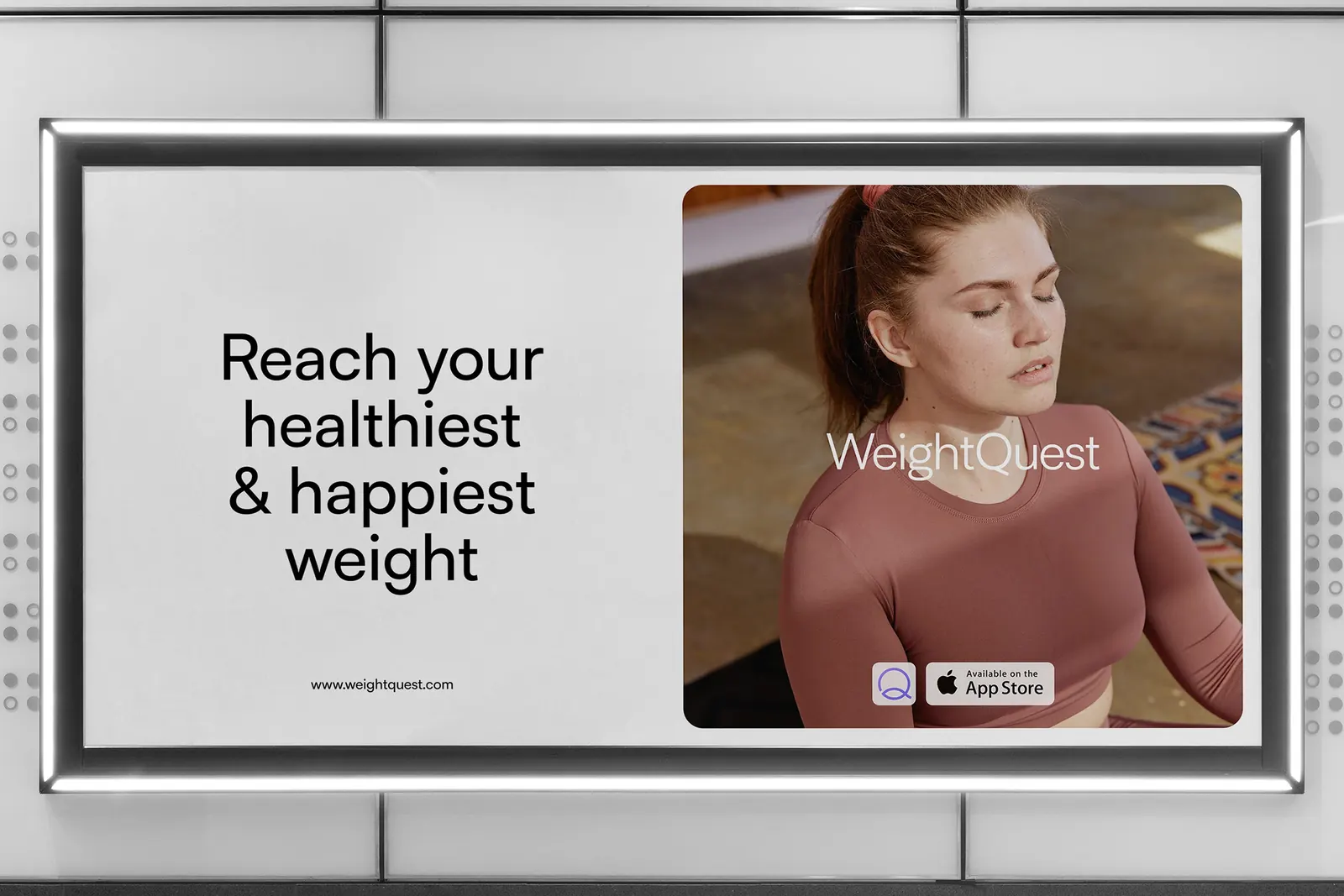
We shaped the brand around simplicity and everyday well-being, so the experience feels guided rather than monitored. The tone is supportive and direct, so WeightQuest stays clear without sounding harsh.

Lumosolar →